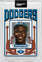
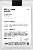
 The Sandy Koufax Grotesk Project 2020 card is now available through Topps and it follows a similar minimalist design he used for the Jackie Robinson card released just a couple of weeks back -- check out that card on the left.
Grotesk uses a pictograph of two persons holding up a portrait of the ballplayer -- while using a font resembling Hebrew writing. No doubt an homage to Sandy's Jewish heritage.
The graphic design itself is reminiscent of a poster you might see in a bus stop or train/subway station. It's approachable and simple, while at the same time emphasizes that this person is to be honored and respected.
 Go here to check the Koufax card out and order the card from Topps online. A complete checklist of all the cards in the set can be found here. The reverse of the card is on the right. BTW, you can follow his twitter here: @groteskito; Instagram: @groteskito. His website is here: grotesknyc.com.
 Below is a current Sandy Koufax checklist of Topps Project 2020 cards with their corresponding artist and print runs. This is the twelfth Koufax card creation to be released so far:
- #2 -- Jacob Rochester -- (link here) 1,135 print run
- #36 -- Oldmanalan -- (link here) 2,488 print run
- #49 -- Andrew Thiel -- (link here) 2,149 print run
- #79 -- Fucci -- (link here) 6,607 print run
- #89 -- Naturel -- (link here) 43,147 print run
- #99 -- Tyson Beck -- (link here) 21,535 print run
- #125 -- Joshua Vides -- (link here) 4,966 print run
- #145 -- Ermsy -- (link here) 6,385 print run
- #162 -- Keith Shore -- (link here) 4,009 print run
- #181 -- King Saladeen -- (link here) 4,369 print run
- #204 -- Sophia Chang -- (link here) 3,043 print run
* Please follow on twitter @ernestreyes *
* Like Dodgers Blue Heaven on facebook *
* Dodgers Blue Heaven home page *


Discover the iconic Topps Project 2020 featuring Sandy Koufax by Grotesk (#230). This piece beautifully captures the essence of baseball's legends, combining art and sports memorabilia. While you're exploring collectibles, don't forget to challenge your brain with wordle unlimited for a fun twist. Engage with both art and word puzzles for a complete experience that celebrates creativity and sportsmanship!
ReplyDeleteI really like Grotesk's approach to this design; it feels both modern and deeply respectful. The use of Hebrew-style font quietly acknowledges Koufax's ancestry, and the composition is reminiscent of a custom dissertation poster, meticulously crafted to highlight the subject's legacy with clarity and purpose.
ReplyDeleteGrotesk's Koufax card is a visual tribute, indeed! The Hebrew-esque font choice is a clever nod. Minimalist, yet powerful, like a vintage public service announcement. I recall facing a similar design challenge when I had to create a poster series for our community event, I tried to reflect the diversity of the population. My mission was to encapsulate unity while acknowledging individual differences which became a block breaker for me in terms of creativity!
ReplyDeleteThe "Topps Project 2020 - Sandy Koufax by Grotesk - #230" card is an impressive tribute to a baseball legend, blending modern artistic style with classic sports history. Grotesk’s design brings Sandy Koufax to life in a way that both collectors and fans can deeply appreciate. The bold colors and unique details make this card stand out in any collection. Just like creating a memorable collectible requires attention to detail and precision, digitizing a logo for embroidery also demands meticulous work to ensure every line and curve is perfectly represented, producing a high-quality, visually striking final product.
ReplyDeleteGrotesk’s Sandy Koufax Project 2020 card stands out for its clean symbolism and cultural respect, turning a legendary pitcher into something that feels timeless and modern at once. The pictograph style and Hebrew inspired typography make it feel more like public art than a standard trading card, which fits Koufax’s legacy perfectly. Collectors who enjoy thoughtful design will appreciate this release.
ReplyDeleteI love the minimalist design of the Sandy Koufax Grotesk card! The pictograph is a clever way to honor his legacy. Reminds me of the focus and precision you need in 8 ball pool to line up the perfect shot.
ReplyDelete